Saturday, February 19, 2005


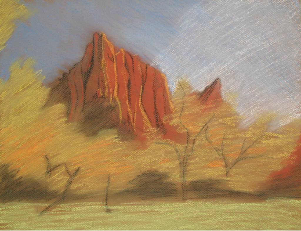
Mountains of Fall
16x20, charcoal on Canson Mi-Teintes board Posted by Hello

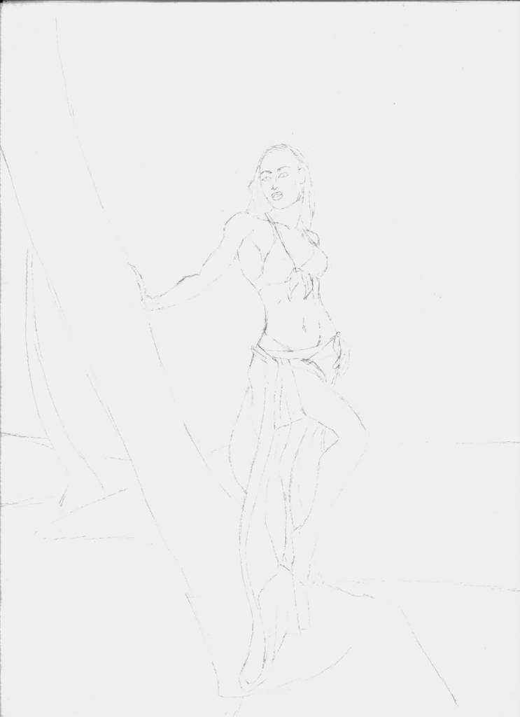
Mountains of Fall (detail)
16x20, charcoal on Canson Mi-Teintes board Posted by Hello

Saturday, February 05, 2005

Painitings of Snow

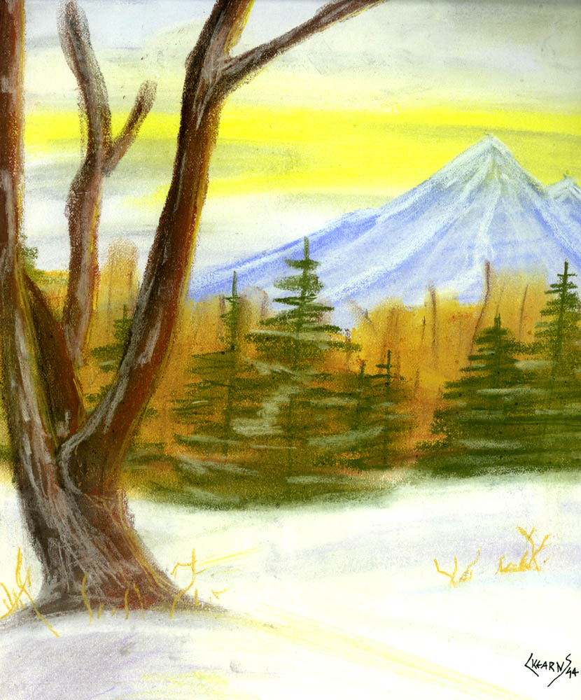
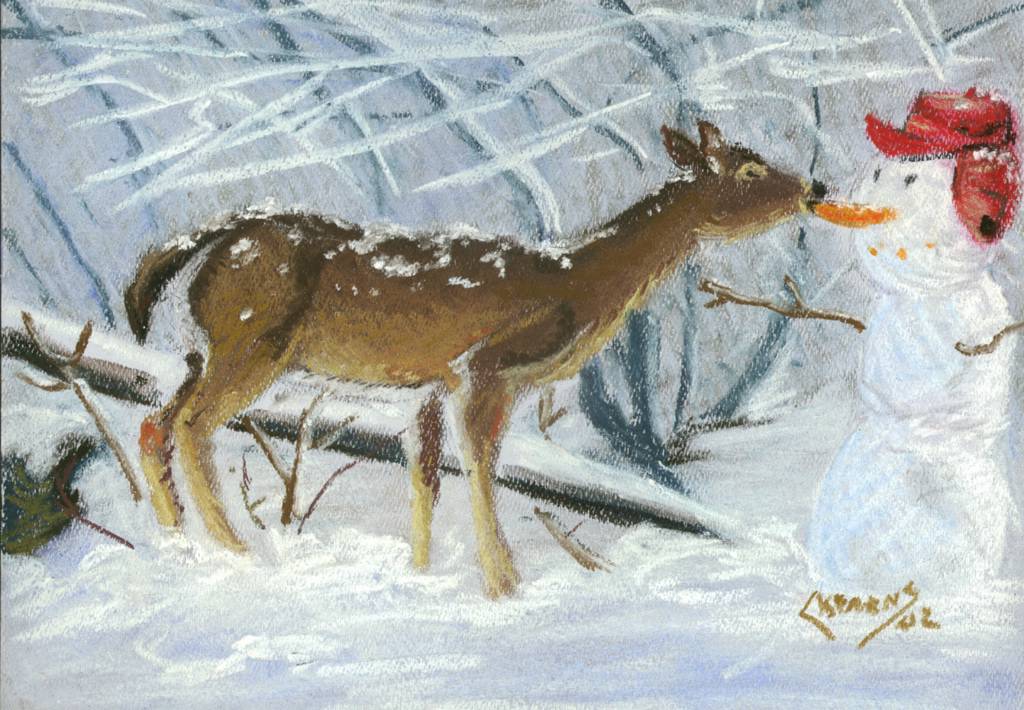
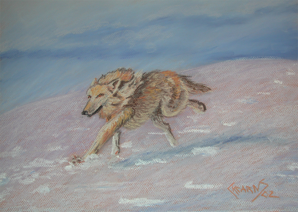
It would seem that paintings about snow are one of my favorite subjects. Just one of those funny observations that you make when you finally begin to catelogue the work you have done over the years.

I probably should have posted these a few weeks ago, it would have been more appropriate after the foot and half of snow that we received. And as should be evident from their style, these are older paintings done in the mid-nineties before I really knew anything about pastels and how to work them. I had no idea aobut uses workable fix to add depth. Nor did I know about the more expensive pastels. I was in grad school at the time and the $35 purchase for a set of landscape pastels was a luxury expense
($35 = 7 meals at Taco Bell). Glad I bought them. It is sometimes good to go back and look at the older stuff, it certainly gives me perspective.

Wintry Twilight
9x12, pastel on paper Posted by Hello

Ice Mountain
9x12, pastel on paper Posted by Hello

Friday, January 14, 2005

Goddess

Been posting mostly grey and black and white pictures of late, so I wanted to show something with more color. This is one of those paintings that I like a lot, but am not so pleased with the name. Really had no idea what else to call it. I should track the original down and take a digital picture so that I can show the beach that she is standing on (why is all art pads 9x12 and all scanners 8.5x11?).

Goddess of Rebirth
9x12, pastel on paper Posted by Hello

Tuesday, January 11, 2005

More Fun with Markers

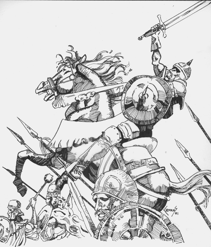
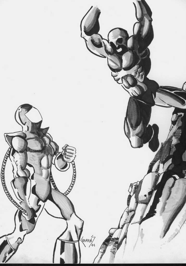
For those of you who liked the horses in the markers (that simulated wash), here are some more. A much different subject matter and one closer to what I wish I could do when I grow up. Hrrrumph, I want to be a comic book artist!!!

The Battle
9x12, markers on Bristol paper Posted by Hello

The Killing Blow
9x12, markers on Bristol paper Posted by Hello

The Leap
9x12, markers on Bristol paper Posted by Hello

Thursday, January 06, 2005

More Japanese Style Art

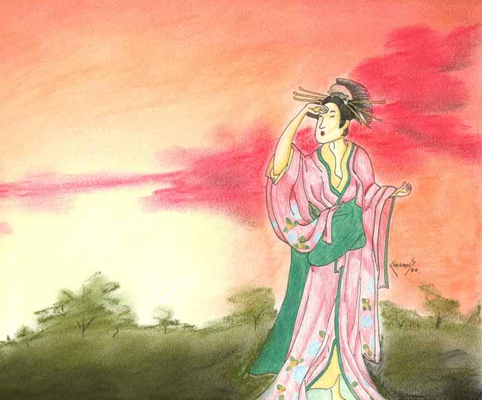
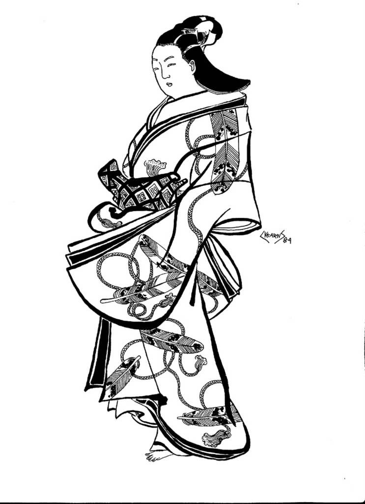
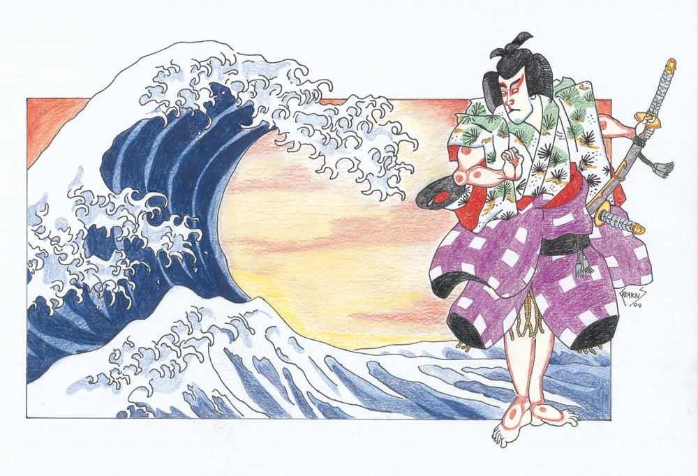
I love Japanese Art and although I have done some work inspired by Japan (and some out right swipes), I do not think that it has really influenced my style all that much. In college, I had a friend, Johnie C, who could create manga-esque illustrations that would make Shirow Masamune proud but I never really wanted to draw like that. Sure I thought it was cool as hell, but for what ever reason, it was not a style that I tried to imitate.

This picture was originally supposed to done completely in colored-pencisl and have a pagoda in the background. Several failed attempts to draw a realistic looking pagoda (that was in perspective) convinced me to try something. . .simpler. After much deliberation, I went with the pastel background you see now. Part of me wishes that I stuck with original design and part of me likes this result.

Geisha 2
9x12, colored pencil with pen and ink and pastel on bristol Posted by Hello

Tuesday, January 04, 2005

New Year. . .Old Art

I had hoped to post some new art work this week, but alas, the holiday break was not as productive as would have hoped. I blame it on the good books that I received and all those college Bowl Games. Don't fret, I have not forgotten about my latest pastel painting and I actually did do quite a bit of work on it. Just not enough to post. But soon.

This finishes up the rest of my commercial art work (unless I find another vault of forgotten art, which is always possible). This is my first and only foray into furniture illustration, pretty satisfying, but not my cup of tea. But it does demonstrate to some (and you know who you are) that I can draw more than landscapes and women who can kick my ass. So there :P

The illustration started with a light pencil sketch followed up by wash (I used a sumi stick and not dilute ink). When it dried, then the pen and ink details were added. I really really like this combination of techniques and this just goes to show how much more versatile I was back when I was a teen-ager. The technique for the add is exactly the same as the fashion figure (I have the original lettering, but I am sure everyone is bored with those large sans serif letters). This one was never wrapped in ascetate and got pretty beat up, sorry about the glue showing through.

About ten years ago I had the opportunity to have this illustration shot on film by a rather large and expensive machine. I love the negative plate, it is so cool.

Hopefully, I get back to painting. So look for more paintings of landscapes. . .and. . .uh, pictures of. . .well, you get the idea.


Furniture Illustration
1ox15, wash with pen and ink on board Posted by Hello

The negative plate for the funiture illustration. Posted by Hello

Furniture Ad Posted by Hello

Tuesday, December 28, 2004

More Commercial Art Projects

This holiday season has not been the super productive time that I had hoped. But then again, this is my vacation and other things need to get done.

I thought that I would post some more commercial art projects. This was the final project of the year and would actually be put together at the beginning of the second year class (which I did not take). Therefore I never finished this project which is a shame. I had seen what the final project looked liked from other students, and it is much cooler than these pieces would indicate.

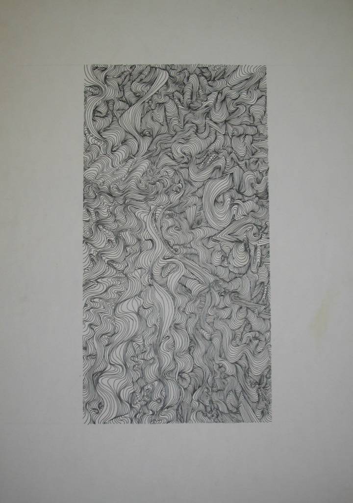
So, the concept: make an abstract cover that was suggestive of sea shells by using free-hand line work to form the illusion of peaks and valleys. This was actually much tougher than it looks. It took me a long time to get the hang of giving these lines depth and if it was not for the help of another student in class, I might never have finished (I heard through the grapevine that the student who helped me has gone on to a very productive career in art, and even worked on the first Shrek movie).

Sea Shell Pamphlet cover 18x24 Posted by Hello

Sea Shell Cover (detail) Posted by Hello

Hand Lettering (3 inches tall) Posted by Hello

Saturday, December 18, 2004

Illustrations and Lettering

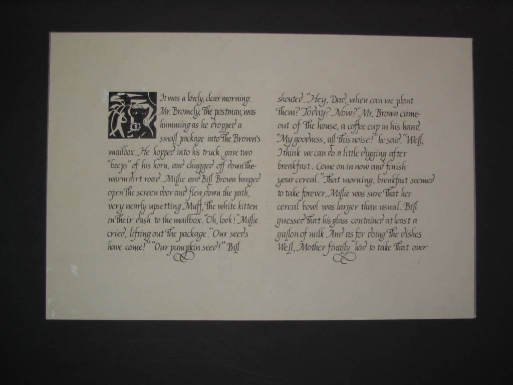
One of the neater projects in my high school commericial art class was doing a page from a children's book. We were supposed to choose a children's book (I chose one written by a friend of my mother). After reading the book, we were to pick out eight symbols/characters from the book and make a single symbolic illustration that would fit into a 2-inch by 2-inch square. Next, using calligraphy, we were to hand letter the first couple of paragraphs. The illustration is not one of my favorites, but I was quite satisfied with the lettering.

To make extra money in high school and during undergrad, I would do all sorts of hand lettering for people (i.e. wedding invitations, seating cards etc. . .). Now with computers, there really is not much cause for hand lettering.

Children's Book page Posted by Hello

Children's Book page (detail) Posted by Hello

Tuesday, December 14, 2004

Fashion Figure Ad

As I mentioned in previous posts, I have unearthed my old high school portfolio. My high school had an intense commercial art program that did a great job of placing students at the School of Visual Arts, Parsons School of Design or FIT. The curriculum was tough, but it stretched me as an artist. Although I chose not to go to a NYC art school, opting instead to go to a regular university, I still remember these classes. Sometimes I wish I had become an artist or pursued my dream of being a cartoonist, but I did not want to live the cliché of a “starving artist” (wish someone would have informed about the cliché of a “starving graduate student”).

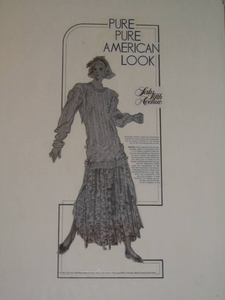
Before computers and their wonderful font programs, commercial artist had to do much of their lettering by hand, especially for ad layouts. The letters for my ad assignment were 3 inches tall and are shot down (forgot the name of the machine) to size. I hated hand letter. If you look closely, you can see the Dr. Martin’s Bleedbroof White, which I became quite proficient with over the years. Incidentally, I think the spilt ink in the corner lends the final personal touch.

The fashion figure was painted entirely with a brush on 18-24 inch cold press paper. Of all my work in high school, I am most proud of this figure. I had never before used a brush to draw. The brush allows for incredible control in line thickness. Plus it is really cool. And yes, the figure does have a disproportionally long torso because this is the way they are supposed to look.

The final layout, in my opinion, was quite dynamic. I think this was the highest grade I ever attained in the commercial art class, probably a B or B+ (obviously, I never earned an A).

Hand Lettering (3 inches tall) Posted by Hello

Fashion Figure 18x24 Posted by Hello

The Final Ad 18x24 Posted by Hello

Sunday, December 12, 2004

From the Mind of a 14 year old boy

Back in high school I took every art class available because all I wanted to be was a cartoonist. In one of my drawing or design classes we were asked to design a new lettering style. This was back in the mid-80's before computers and font packs, so much of professional lettering was still done by hand (more samples of this later). Me being the huge comic book geek that I was, I did something decidedly different. Drawing inspiration from the ninjas and Electra in Frank Miller's run on Daredevil, I designed "The Ninja Alphabet" or "Ninjalphabet" for short. I alternated between the black and white ninjas and tried to incorporate every weapon that I could remember. My favorites are the ones where the ninjas are injuring themselves (E, P, R) and I especially like Q and W, where the two ninjas are just hanging out. It was probably one of the more fun things that I ever got to do in school. I got to screw around and get an A, not too shabby.

More fun stuff from high school coming soon.

The NIJALPHABET Posted by Hello

Saturday, December 11, 2004

From the Archives

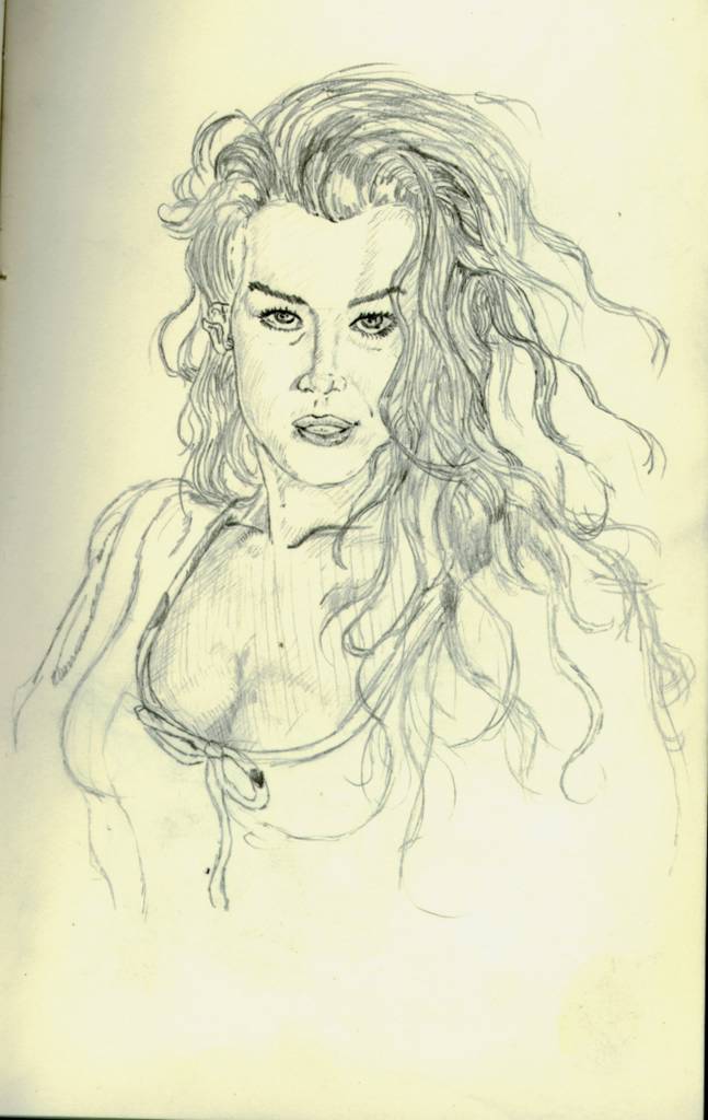
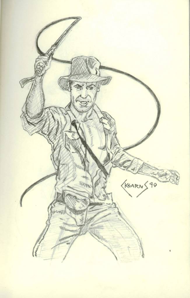
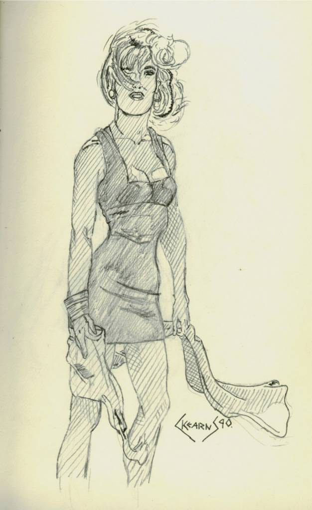
Those who braved the old website should already be familiar with my old pencil sketches and my desire to move everything from there to here. This use of heavy cross-hatch was my favorite style (compared to the minimalist style I am currently using). And for the longest while, the only real medium that I used was pencil, mostly the trusty ol' number 2 pencil (not just for taking scan trons) but sometimes I would use HB, 2H, 4H, 2B and 4B.

I just found my old portfolio locked in storage. I always wanted to digitize them, but at the time (late 80's), there were only very expensive options. Plus, they are far to big to scan now. The digital camera should work just fine. Look for them early next week.


Woman with nice hair
6x9, pencil on paper Posted by Hello

Indy
6x9, pencil on paper Posted by Hello

Girl with scarf
6x9, pencil on paper Posted by Hello

Wednesday, December 08, 2004

Not feeling the love. . .

Hmmm. . .Not feeling the love with this picture. It looks more like something you'd see in Veiwtiful Joe than what I was imagining. Not that this is necessarily a bad thing, but I had other hopes for this picture. Part of my issues, I guess, is that I was working with a limited palette of colors. I had planned on buying a bigger set of watercolor pencils, now my enthusiams is not as strong (but they really aren't that expensive, so I still might). I have not yet abandoned this technique just yet, but I am getting close.

So, what does everyone think about this multi-media technique?

Summer by the Tree
9x12, watercolor pencils with ink and pastel on paper Posted by Hello